


You have 0 item in your shopping cart.
Subtotal:
$0.00
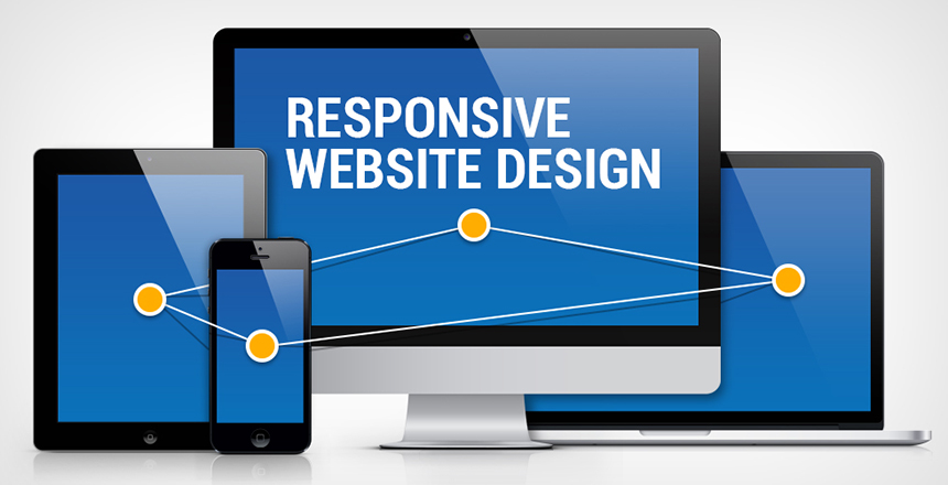
With responsive website design, your website (and its pages) can adapt and deliver the best experience to users, whether they’re on their desktop, laptop, tablet, or smartphone. For that to happen, though, your website needs a responsive design.
What is responsive web design, though, and how does it work?
Responsive web design, also called RWD design, describes a modern web design approach that allows websites and pages to render (or display) on all devices and screen sizes by automatically adapting to the screen, whether it’s a desktop, laptop, tablet, or smartphone.
Responsive web design works through Cascading Style Sheets (CSS), using various settings to serve different style properties depending on the screen size, orientation, resolution, color capability, and other characteristics of the user’s device. A few examples of CSS properties related to responsive web design include the viewport and media queries.
You can also use a free tool, like Google’s Mobile-Friendly Test, to see if pages on your website are mobile-friendly. While you can achieve mobile-friendliness with other design approaches, like adaptive design, responsive web design is the most common because of its advantages.
Responsive web design relieves web designers, user interface designers, and web developers from working day and night creating websites for every single different device in existence. It also makes the lives of business owners, marketers, and advertisers easier.
Here are a few benefits:
Responsive web design is also effective from a price standpoint. It’s also easier for you to manage because it’s one site versus two. You don’t have to make changes twice. Instead, you can work from and update a single website.
Comments